Why Your Pitch Deck Matters More Than You Think
Your pitch deck is not a slideshow. It is the single most important document your startup will ever produce. It is the first thing an investor sees, the artifact that gets forwarded around a partnership, and the lens through which every subsequent conversation is framed. A bad deck does not just fail to impress — it actively kills deals before they start.
Most VCs spend fewer than four minutes on an initial deck review. That means you have roughly 20 seconds per slide to land your point. If your deck is cluttered, confusing, or missing critical information, you will never get to the meeting where you can explain what you actually meant. The deck has to do the talking for you when you are not in the room.
After reviewing thousands of decks and making 65+ investments, I can tell you the difference between a deck that raises money and one that gets ignored almost always comes down to structure, clarity, and knowing what investors actually care about. This guide covers all three. If you want the full picture of what VCs look for in a startup, read that companion piece after this one.
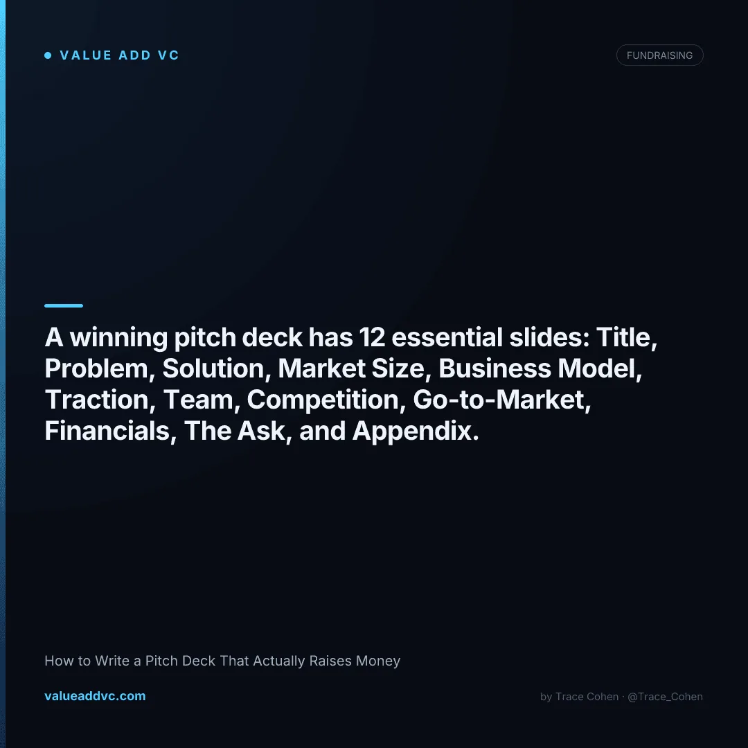
The 12 Essential Slides Every Pitch Deck Needs
There is no universally perfect template, but after sitting on the receiving end of thousands of pitches, this is the structure that works. Twelve slides, in this order, each with a single job to do.
Title / Hook
Company name, one-line description, and your logo. The one-liner should be so clear that someone with zero context instantly knows what you do. "Stripe for healthcare payments" is good. "We are revolutionizing the future of synergistic wellness optimization" is not. This is your handshake — make it firm and memorable.
Problem
What is broken? Who is suffering? How much does it cost them? Use real numbers and real stories. The problem slide should make the investor nod and say "yes, that is a real pain point." Avoid abstract, theoretical problems. If you cannot point to a specific person losing money, time, or sanity because of this problem, you need to rethink your market.
Solution
How do you solve the problem? Show the product. Screenshots, a quick GIF, or a clean product mockup goes a long way. The best solution slides are visual, not textual. Investors want to see the thing, not read a paragraph about it. Keep the description to two or three sentences and let the product speak.
Market Size
TAM, SAM, SOM. Investors want to know the ceiling. Use a bottom-up approach: "There are X potential customers willing to pay $Y per year, giving us a $Z serviceable market." Top-down TAM numbers pulled from a Gartner report are a red flag — they signal lazy thinking. Build your market size from first principles and you will stand out from 90 percent of decks.
Business Model
How do you make money? Subscription, transaction fee, marketplace take rate, enterprise license — spell it out clearly. Include current pricing if you have it. Investors want to see unit economics even at an early stage: what does it cost to acquire a customer, what do they pay you, and what is the lifetime value? Even rough numbers show you are thinking about the business, not just the product.
Traction
This is the slide that separates real startups from ideas. Revenue, users, growth rate, retention, partnerships, LOIs, pilot programs — anything that proves people want what you are building. Use a chart that goes up and to the right. If you are pre-revenue, show waitlist sign-ups, pilot commitments, or letters of intent. Something has to demonstrate momentum.
Team
Why is this the team to win? Highlight relevant experience, domain expertise, and previous exits. Investors bet on people first at the early stage. Include headshots, names, titles, and one line about why each person is uniquely qualified. If you have notable advisors or investors already on board, mention them here. Do not list every team member — focus on the founding core.
Competition
Every startup has competition — saying "we have no competitors" is the fastest way to lose credibility. Use a 2x2 matrix or feature comparison table. Position yourself clearly and explain your sustainable advantage. The best competition slides acknowledge strong incumbents and then clearly articulate why your approach is fundamentally different, not just incrementally better.
Go-to-Market
How will you acquire customers? Be specific. "We will use digital marketing" is not a strategy. "We will partner with 50 dental offices in Miami through our founder's existing network, converting at 30 percent based on our pilot" is a strategy. Show that you understand your customer acquisition channels, cost per acquisition, and how those channels scale over time.
Financials
Three-year projections showing revenue, expenses, and key milestones. Investors know these are projections, not promises. What they are really evaluating is whether you understand the levers of your business: how hiring, marketing spend, and product development translate into revenue growth. Keep it simple — a clean bar chart with revenue and burn rate over 36 months is enough.
The Ask
How much are you raising, at what valuation (or note terms), and what will you do with the money? Break the use of funds into three to four buckets: product development, hiring, go-to-market, and operations. Be specific about what milestones this capital will help you hit, and what those milestones unlock (e.g., "$1.5M gets us to $100K MRR, positioning us for a strong Series A"). For a deeper dive on raise amounts by stage, check our guide on Pre-Seed vs Seed vs Series A.
Appendix
Additional detail for investors who want to go deeper: detailed financials, product roadmap, customer testimonials, technical architecture, or press coverage. The appendix should never be necessary to understand the core pitch, but it shows you have done the work. Smart investors will flip to the appendix after the meeting — give them something to find.
Design Principles for a Winning Deck
Content is king, but design is what gets people to pay attention to the content. A poorly designed deck signals sloppy thinking, even if the business is brilliant. Here are the principles that separate professional decks from amateur ones:
Clean and Minimal
Every slide should have one key takeaway. If you cannot summarize a slide in one sentence, it has too much on it. White space is your friend. Remove every element that does not directly support the point you are making.
Data-Heavy, Not Text-Heavy
Replace paragraphs with charts, graphs, and metrics. A single chart showing 10x monthly growth says more than three paragraphs of explanation. Investors scan — make the data impossible to miss.
No Walls of Text
Maximum 30 words per slide in body text. Use bullet points sparingly. If you need more than three bullets, you are trying to say too much. The deck supports your verbal pitch — it does not replace it.
Consistent Branding
Use two fonts maximum (one for headings, one for body). Stick to two or three brand colors. Every slide should look like it belongs to the same family. Consistency signals attention to detail.
Tools like Gamma make it easy to build polished, on-brand decks without needing a designer. Check out our full Gamma review for more on how it works.
The 5 Slides VCs Actually Spend Time On
Research from DocSend analyzed over 200 fundraising decks and tracked exactly where investors spent their time. The results might surprise you. Most founders over-invest in the slides that matter least and under-invest in the ones that close deals. Here is where the attention actually goes:
1. Financials
~23% of timeThe single most scrutinized slide. Investors want to know if you understand your own numbers. Revenue projections, burn rate, and path to profitability or next round.
2. Team
~19% of timeAt the early stage, investors bet on people. They are looking for founder-market fit, relevant experience, and whether this team can execute against the plan.
3. Traction
~15% of timeProof that something is working. Growth curves, retention metrics, and revenue milestones are the most compelling data points you can show.
4. Product / Solution
~12% of timeInvestors want to quickly grasp what the product does and whether the UX looks competent. Screenshots and demos beat descriptions every time.
5. Business Model
~10% of timeHow you make money matters. Investors are evaluating whether the model is scalable, has strong margins, and whether the unit economics can work at scale.
Notice what is not on this list: the competition slide, the market size slide, and the go-to-market slide. They matter, but they are not where investors linger. Spend 80 percent of your time perfecting the five slides above and you will dramatically improve your conversion rate. For even more on the investor mindset, read What VCs Look For in a Startup.
Common Mistakes That Kill Deals
I have seen every version of these mistakes across thousands of decks. Any one of them can be the reason your email never gets a reply. Avoid all seven.
Too Many Slides
Anything over 15 slides signals that you cannot prioritize. The best decks are 10 to 12 slides. If you need more, put the extras in the appendix. Investors will not read a 40-slide deck.
No Clear Ask
You would be amazed how many decks never mention the raise amount, terms, or use of funds. Make the ask crystal clear: amount, instrument, and what milestones it unlocks.
Vanity Metrics
"500K app downloads" means nothing if retention is 2 percent. Lead with metrics that matter: MRR, net revenue retention, CAC payback, and active user growth. Experienced investors see through vanity numbers immediately.
"No Competition"
Claiming you have no competitors tells the investor one of two things: you have not done your research, or there is no market. Both are disqualifying. Every company has competition, even if it is the status quo.
Unrealistic Projections
Projecting $50M in revenue by year three with two employees and no sales team is a credibility killer. Show aggressive but defensible growth. Explain your assumptions and be ready to back them up.
Burying the Traction
If you have strong traction, do not hide it on slide 11. Some founders move traction right after the solution slide when the numbers are compelling. Lead with your strongest evidence.
Sending a PDF Without Context
A cold email with just a PDF attachment and "please review our deck" will be ignored. Always include a brief, compelling email body with your one-liner, traction highlight, and specific ask. The email is the pitch for the pitch. Use a trackable link so you know when investors open it and which slides they spend time on.
How to Present Your Deck
A great deck with a bad presentation still loses. The way you deliver the pitch matters as much as the content itself. Here are the rules that consistently produce the best outcomes in investor meetings.
The 10-Minute Rule
Your core pitch should take no more than 10 minutes. That leaves 20 minutes in a standard 30-minute meeting for questions and discussion — which is where deals actually get made. If your pitch takes 25 minutes, you are talking too much and learning too little. Practice until you can deliver the full deck in under 10 minutes without rushing.
Tell a Story, Not a Report
The best pitches follow a narrative arc: here is a painful problem we experienced firsthand, here is how we solved it, here is why the timing is right, here is proof it works, and here is how we scale it into a massive business. Every slide should flow logically into the next. If you can present without looking at the slides, you know the story cold.
Know Your Numbers Cold
If an investor asks about your CAC, LTV, burn rate, or runway and you fumble, the meeting is effectively over. You should be able to answer any financial question about your business without hesitation. Practice with a co-founder or advisor who will grill you on the details.
Handling Q&A Like a Pro
Welcome tough questions — they mean the investor is engaged. Never get defensive. If you do not know something, say so honestly and commit to following up. The best founders turn hard questions into opportunities to demonstrate depth. Prepare answers to the 20 most likely questions before every meeting. Common ones: "Why now?" "What if Google builds this?" "How do you get to $100M?" and "What is your biggest risk?"
Tailor to Your Audience
Research the VC before the meeting. Know their portfolio, their thesis, and their recent investments. Reference a relevant portfolio company where appropriate. A pitch to a fintech-focused fund should emphasize different things than a pitch to a generalist. Use our VC Universe tool to research investors before your meetings.
Follow Up Fast
Send a follow-up email within 24 hours with a thank-you, answers to any questions you could not address in the meeting, and a link to your deck. Speed signals professionalism and urgency. Include any additional materials they requested and propose clear next steps.
Tools for Building Your Deck
You do not need a graphic designer to build a professional deck. The right tool can save you dozens of hours and produce results that look like a design agency was involved. Here are the options worth considering:
Gamma (Recommended)
TOP PICKGamma is an AI-powered presentation tool that turns your ideas into polished, professional decks in minutes. It handles layout, design, and formatting automatically so you can focus on the content. The results consistently look better than what most founders produce in PowerPoint or Google Slides after hours of work.
Try Gamma freeCanva
Solid free option with hundreds of pitch deck templates. Good for founders who want more manual control over design but still want a professional starting point. The drag-and-drop interface makes customization easy.
Figma
The power tool for founders with design skills or a designer on the team. Maximum creative control and pixel-perfect layouts. Higher learning curve, but the output can be exceptional if you know what you are doing.
Google Slides / PowerPoint
Still the default for many founders. Universally compatible and easy to share. Use a clean template and resist the urge to use every animation and transition available. Simple always beats flashy in investor decks.
Ready to Build Your Deck?
Use Gamma to create a polished pitch deck in minutes, explore the VC Universe to find the right investors, and grab a copy of the Value Add VC book for the complete fundraising playbook.
Get VC data most people never see
— 100% free
Weekly benchmarks, valuations, and fund data. Join 5,000+ investors. No spam.